
This was the research question I answered for my 10,000-word undergraduate thesis, in which I achieved a First-Class Honours result.
Augmentative and Alternative Communication (AAC) is a speech supplementation method used by individuals with speech impairments and/or disabilities. It’s important that designers like myself are willing to learn, to ensure our interfaces are appropriate for anybody to use. I took on this project because I wanted to learn about how to design for disability, I wanted to gain knowledge on this topic as it wasn’t something I felt I knew enough about.
I designed and coded a progressive, responsive, web app allowing individuals with speech impairments to communicate their needs and feelings to a family member, a teacher at school or someone unfamiliar to them. Communicating can sometimes be extremely difficult for them to do without the appropriate tools.
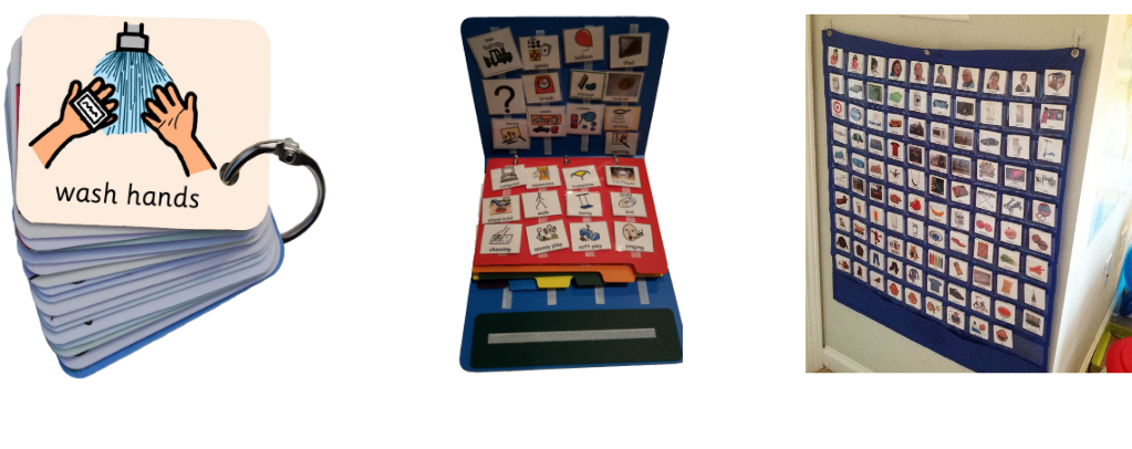
I interviewed a speech and language therapist who works in a special needs school in London. We discussed the current speech supplementation methods used by the school. For example, a series of laminated A4 pieces of paper bound together with treasury tags. Children using this method were able to communicate by pointing at the symbols and showing their teacher. The therapist voiced some flaws with these methods. Children with low functioning autism would often point straight to the final symbol. For example, if a child wanted to go to the lunch hall to eat, they would point straight to the lunch hall picture, which is not good communication they want to teach their pupils.
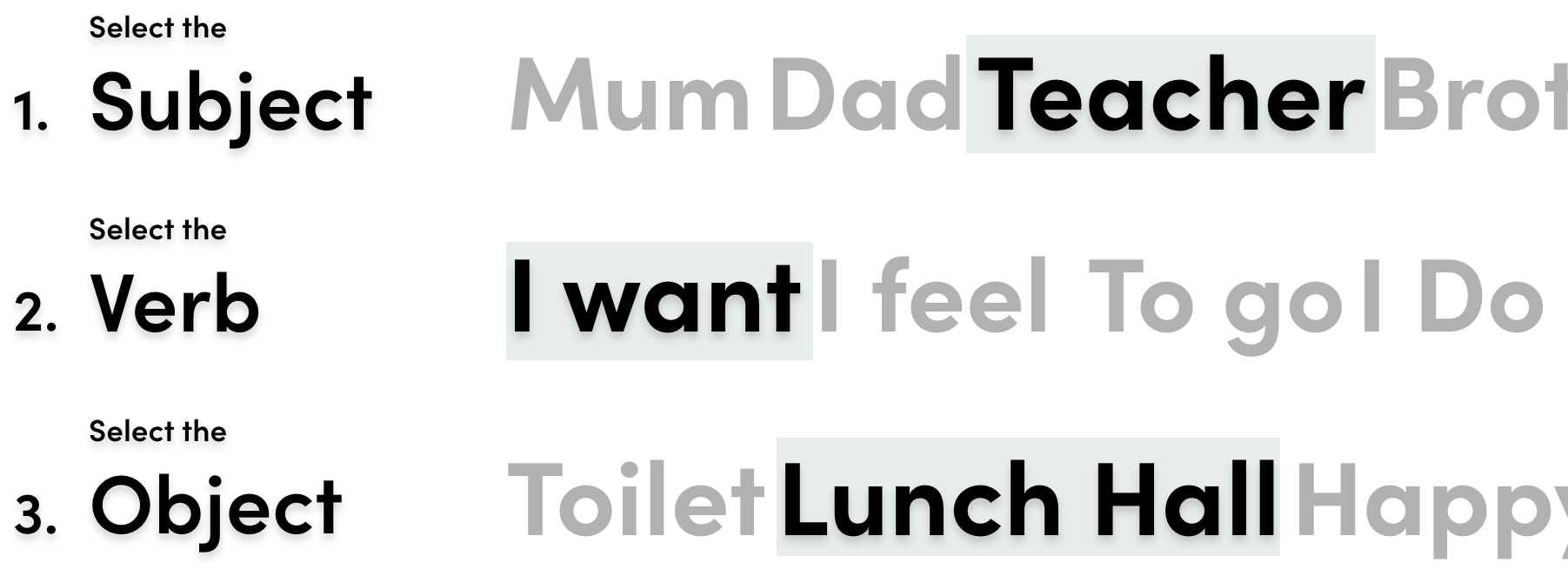

Children should be taught that communication has a series of steps. First, pick the subject whom you are communicating with; I, YOU, TEACHER, MUM, DAD. Second, pick the verb such as; WANT, GO, DO. Finally, pick the object word; LUNCH HALL, PLAYTIME, HAPPY.
I saw this as an opportunity to design a system which could help children improve their communication by removing the issues of other speech supplementation methods, with as PECS.
It was important that the system was responsive. iPads are an essential part of education for those on the spectrum. I made sure my system was responsive for this medium. Whilst tablets are very practical at school and at home, they may not be when a child is out and about, when shopping for example. Therefore, I coded the interface to be responsive on mobile. This way parents/guardians can load it on their phones quickly. The images below show how I went about the design on mobile, to represent the three-step communication process identified.

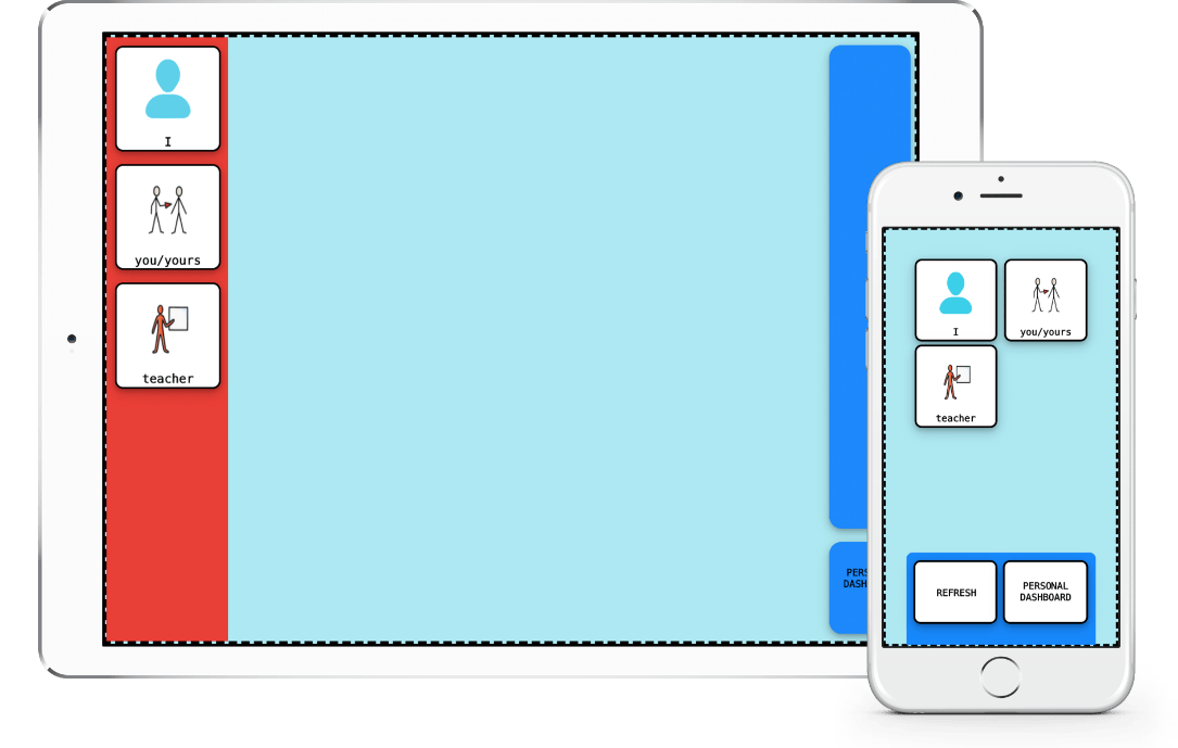
In tablet mode, the user is presented with one column initially. They need to select a subject so the interface can produce a response, and as soon as they do, the verb column appears with all the available symbols they can tap on.

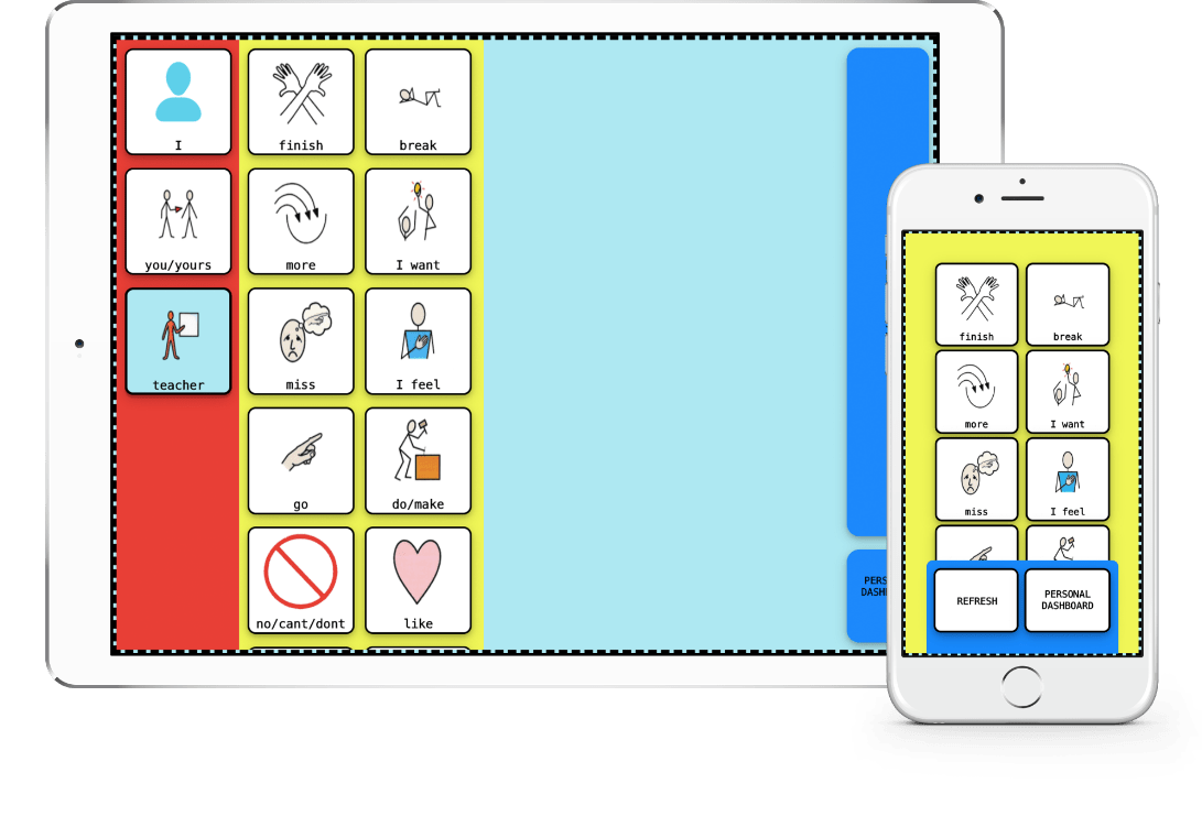
Now that the subject has been selected, the verb column is visible. this section also includes symbols that the speaker may need quick access to, symbols that may be used alone. Such as, when asking for a break, or rejecting something by taping on the no symbol.

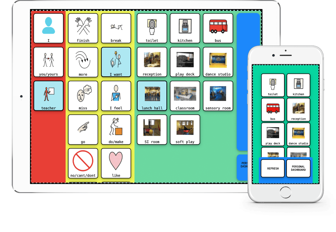
After selecting a verb, the final object column appears presenting all the object symbols. Here the user can tap on a square to complete their communication process. At every step of the communication process, the ‘restart’ button is shown so a user can quickly repair any interaction which has gone wrong.

Three-step communication approach identified: (from left to right) subject screen - user selects which person they want to direct their communication to. Verb screen - user selects verb such as 'I want', 'I feel'. This screen also contains core words the user may need quick access to. Object screen - user selects their final word, what the want, how they feel. Example: Teacher, I want, toilet. A synthesised computer voice plays an audio clip at each stage. This audio response is useful for the listener in the conversation.


As required from my thesis submission, I designed and constructed a physical representation of my work. As my thesis researched speech supplementation methods such as AAC & Picture Exchange Communication System (PECS), my physical artefact took on the form of PECS to represent the limitations that this method could pose to children using them. Furthermore, I discussed how AAC could remove some of the limitations caused by other methods.
I designed my own communication symbols, with inspiration from Widgit Symbols, which represent the content of each chapter. The person reading the artefact will arrange the symbols in the order they believe makes the most sense, by attaching them to the Velcro strip inside the binder. I believe this allows an individual with no disabilities to experience how difficult communication through symbols can be for someone on the spectrum, especially when the method of speech supplementation has its own limitations. The process of attaching a symbol to a Velcro strip represents how some children may communicate, by taking a symbol and attaching it to a wall or pointing to it.

